You Should Own Hats (!) | Peruse past YSOA Editions here | Follow the YSOA Instagram here
Hey there friends.
I’m real excited about this one. Comics and Graphic Novels were my gateway into making art. I still find myself dipping into the comic store by me just to take a look and somehow walking out with $60 worth of books. As a form, comics are complicated. The origins are as broad entertainment, and yet over the decades it’s evolved into a highly elevated form of storytelling. Taken along, the visual elements can be profound. I find that isolating single pages or panels from their narrative context can create a deeply compelling experience with all the ambiguity and mystery of great works of art. It’s a whole world worth exploring.
And so, I’m very happy to introduce you to the artist and designer Tom Manning. I met Tom several years ago when we both worked at the storied creative firm Frog Design. I soon learned that Tom trafficked in the comic arts and immediately became a fan of his work.
Tom has kindly shared his thoughts on the form and his experience as an artist. He also has some recommendations of where to find original works. I hope you will enjoy this as much as I have:
I’ve been making comic books since I was in 4th Grade (which is to say for nearly 40 years), so I can remember the time when comics were an under-appreciated medium. A time before comic book characters fueled billion dollar movies, and comic book creators won Pulitzers. Despite comics now being an integral part of our culture, the artform remains somewhat esoteric.
Perhaps this can be attributed to the hybrid nature of comic book art—an amalgamation of text and image, literary and cinematic elements, composed of static sequential elements that imply motion. Comic book pages are crafted using principles borrowed from graphic design, painting, photography, and cinema. Some perceive this hybrid nature of comic book art as derivative, while others find it too diverse to discuss cohesively.
But for me it is a craft I have loved to study and hone for decades. I write, pencil, ink, letter, and design the books I make because each element seems too important to hand off to anyone else. It is an artform for control freaks, one I imagine directors like Kubrick or Hitchcock loving. When creating a comic book, not only are you the writer, but also the director. The cinematographer. Editor. Location scout. The set, costume, lighting, and character designer. Extensive planning precedes the actual drawing of a page.
An unfortunate truth about comic books is they are one of the most time intensive mediums: a page that took eight hours to complete might be read in two seconds. A book that took a decade to complete might be finished in a few hours. But comic book creators don’t love this medium because of its efficiency. They love it for the intoxicating mixture of building a world, and falling into it. There are moments while drawing a comic book page when the world you are bringing to life is so tangible you disappear into it for hours, entering a flow state in which time melts away.
As if comic book creation wasn’t time intensive enough, when making my graphic novels I go a step further by adopting four restrictions:
No thought balloons
No captions (the text often found in rectangles often containing location, time, descriptive, or editorial information)
No color
No computers - do everything by hand
The first two restrictions force me to live by the golden rule of writing: “Show, Don’t Tell.” The outcome are scenes that are more cinematic, more impactful. For example, since I can’t use a thought balloon that says “I don’t trust him,” I am forced to get that feeling across through body language or composition to get that feeling across. Since I can’t use a caption like “one week later,” I am forced to transmit that information through an object like a calendar, or by incorporating it into dialogue.
The third and fourth restrictions create a better integration of text and image on the page. Color comics with digital black-and-white text balloons look as if they are composed of two layers: like the illustrations are overlaid with a layer of clear acetate containing the word balloons. This disconnect between elements harms the composition of a page, and blocks the reader from disappearing into the story.
Of course this is my opinion, my approach. And by exposing yourself to various comic book creators, it is fun to find patterns, strategies, and techniques that they deploy, thus creating their own distinct styles.
So with this I hope you take some time to try and appreciate the art of the comic book: consider the elements of the page and how they may be placed to pace your reading of it. Look at the blocking of the scene, the angle of the “camera,” the use of black and white spaces, the “lighting.” What principles of graphic design are found on the page? Of photography? Of literature? Of cinema?
Spend some time with the strange chimera that is comic book art. Don’t worry, it won’t bite.
My graphic novels are available on Amazon and here:
(AC note: I have the complete set - totally worth it)
Original pages from my graphic novels are available here:
https://www.athenaeumcomicart.com/shop?Category=Tom+Manning
Some great places to purchase comic book art:
Athenaeum Comic Art
Selling art of upcoming and underground indie artists
https://www.athenaeumcomicart.com/
Galerie Martel
Selling art of indie comic book superstars such as Chris Ware, Dan Clowes, and Charles Burns
https://www.galeriemartel.com/artistes/
Comic Art Tracker
Collects all comic book art for sale in a single place, making it easy to search by artist, title, character, etc.
https://comicarttracker.com/en
(AC Note: I’m back again)
Here are some works from the some of the sources above and a few others.
Eric - Pg. 109
Tom Manning
USD$300
This is a great example of the affect of a panel when extracted from the narrative. TBH, the narrative of Eric is hardly less surreal, but as a stand-alone work of art, this is a deeply interesting image.
You can buy this work here.
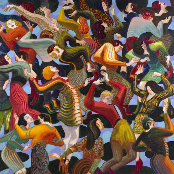
Danza 1
Lorenzo Mattotti
EUR€220
For me this evokes a few painting from the early twentieth century. There’s such motion in the overall picture, but each character is a universe unto itself.
You can buy this work here.
Lorenzo’s Instagram
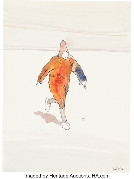
Desert B Smoking Runner
Jean Giraud (Moebius)
Current bid USD$370
Generally, I don’t like to include works that are up for action because the price changes dramatically. That said, I want to seize the opportunity to share with you the work of Moebius. His work influenced generations of artists and filmmakers. When you see this particular quality of line, and this minimal palette out in the world, now you know where it came from.
You can buy this work here.
Interlude
People should own art. You already know this, because you own this hat. And the people that don't know, will now know, thanks to you, and your new hat.
This one is Blue. You may buy it here.
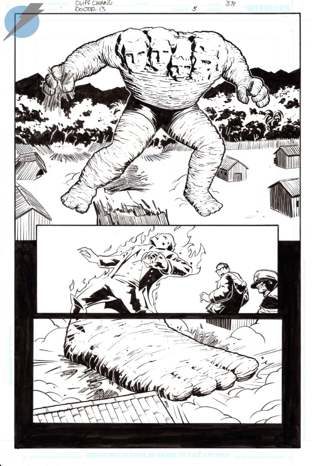
DOCTOR 13 , Issue: 5 , Page: 38
Cliff Chiang
USD$400
Ok, I realize that it’s counter to the argument I’m trying to make here to continually locate works in the canon of Fine Art, however, this could be a particularly demented Neo Rauch painting. I love it.
You can buy this work here.
Cliff’s Instagram
The Devil's Grin 1 - Pg.47
Alex Graham
USD$350
If none of y’all buy this, I’m going to have to. I mean, what the heck is happening here? And I love the qualities of the drawing. Fascinating.
You can buy this work here. Or I will.
Alex’s Instagram
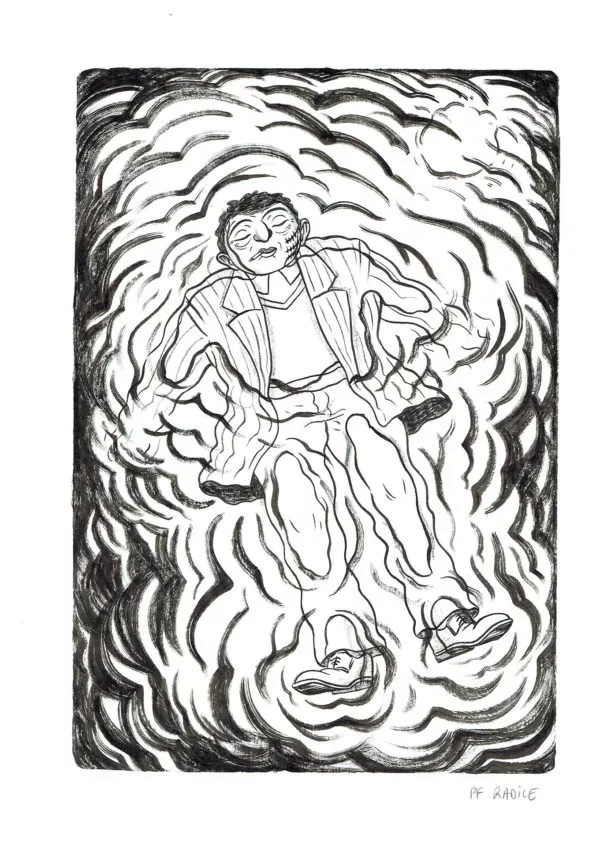
Al Capone page 156
Pierre-François Radice
EUR€800
I’m in love the composition of this. The vignetting created by the shading of the ripples give the sense of beatific peace after violence.
You can buy this work here.
Couldn’t find an Instagram for Pierre-François. If you come across one, kindly let me know.
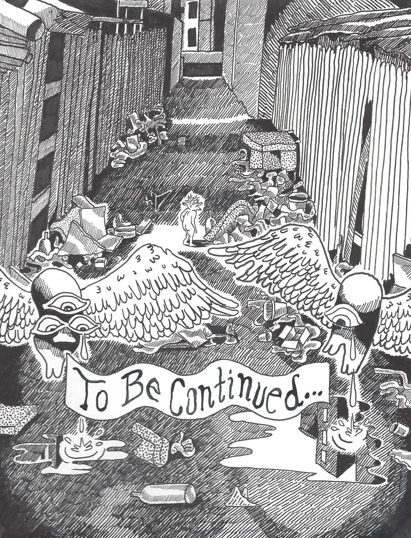
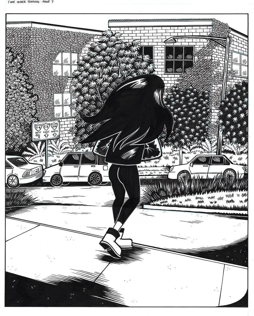
Time Under Tension - 7
M.S. Harkness
USD$600
What makes this particularly compelling is that inverts the traditional principles of composition. In general, and artists will concentrate details within the focal area of the image - most often in the center - and the background will be more vague, if not completely abstract. Not so here! The background contains intricate details with bricks an leaves individually drawn. And at the center the figure is a really simple black form little detail. You can sense the presence of story without knowing the narrative.
You can buy this wok here.
M.S. Harkness’s Instagram
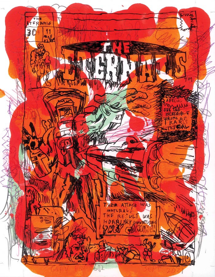
The Eternals
Gary Panter
EUR€190
Wow, brilliant. It’s as much a commentary on the form as it is an exemplar. I also admire work that is very loose but very accomplished.
You can buy this work here.
Gary’s Instagram (I think)
Alright! That’s it for this edition. Thanks so much of reading.
A gigantic thanks to Tom for contributing. So interesting and inspiring.
Please check out the artists and their work. Give them a follow, sign up for their newsletter, and hey, maybe buy their art.



This was super interesting!! One of my favorite classes in college was a deep dive course on graphic novels, and I remember being fascinated with the artwork from the get go. Now all I have to do is resist buying everything here and falling down yet another rabbit hole 😂